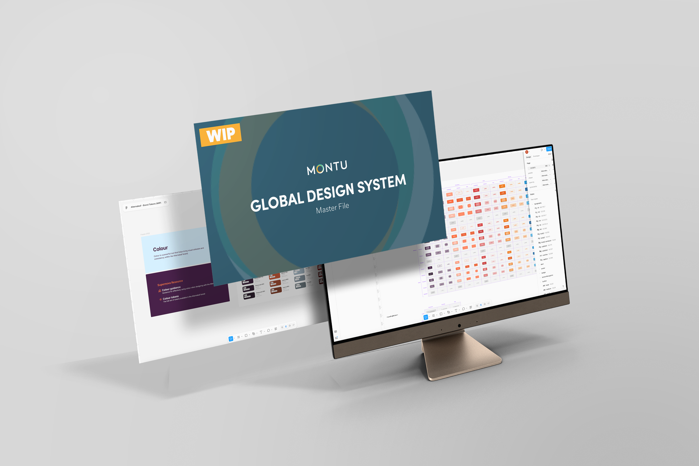
Montu Design System
Montu ran four design systems across four brands. They were built on the same underlying infrastructure, but they lived as four separate Figma files, each maintained on its own. Keeping them aligned was manual, and drift set in almost immediately.
The cost showed up everywhere. Consistency across the four files became a constant struggle, shipping slowed, and onboarding a new designer meant explaining which file was the source of truth for what, alongside a set of hackier workarounds to keep things moving.
The clearest evidence came from a version check. One design system was running MUI v5.17 while another sat on v5.16, for no reason other than nobody had updated it.
Meanwhile the engineering side had already solved its half of the problem. The code repo had moved to a monorepo, where components were themed according to whichever brand was using them. So the real gap was not between the brands. It was between design and code, and that gap was the opportunity.
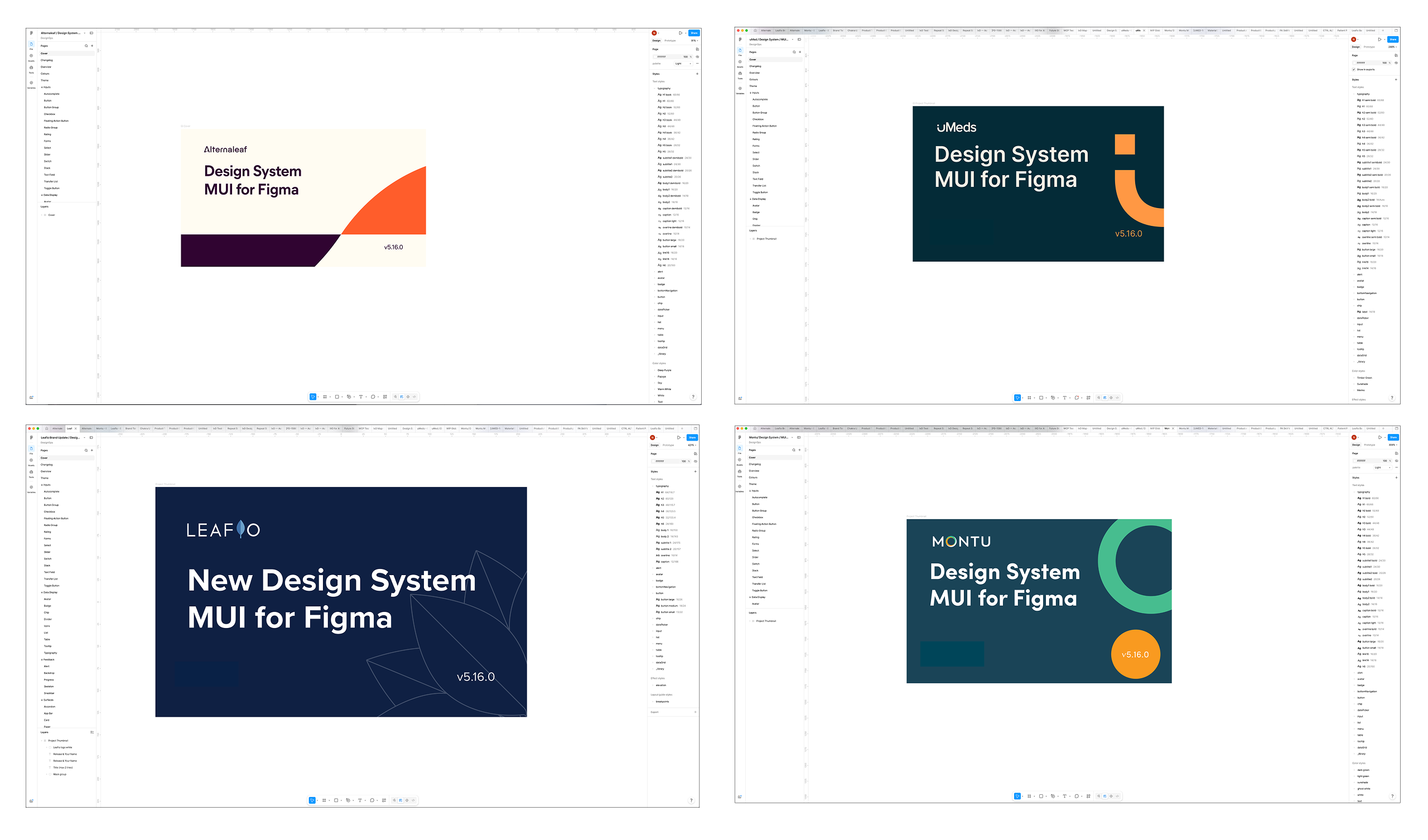
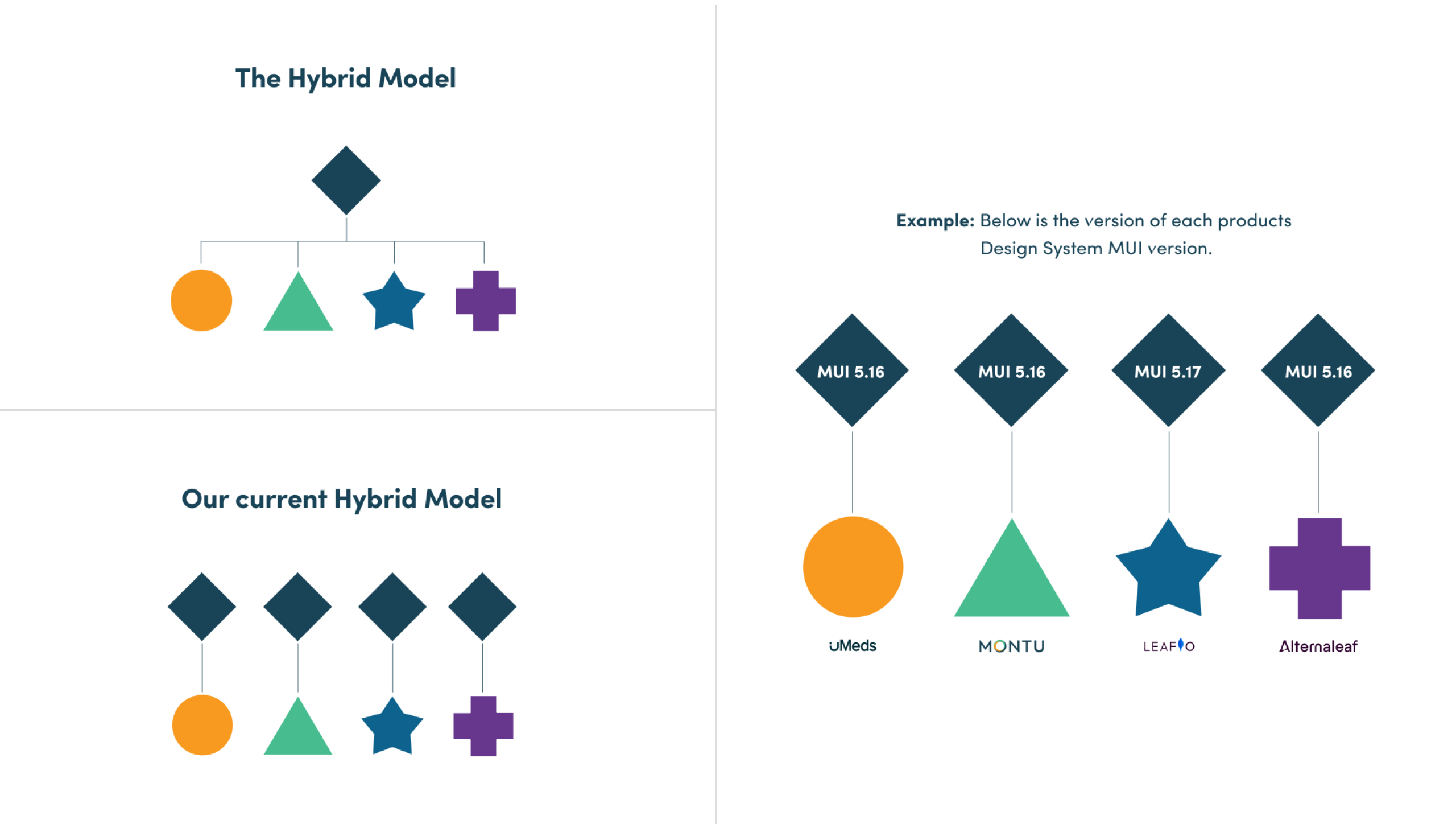
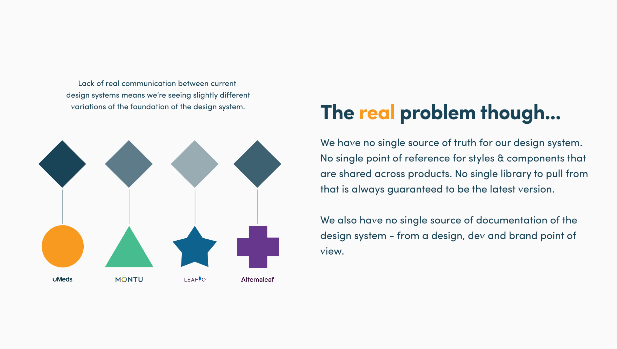
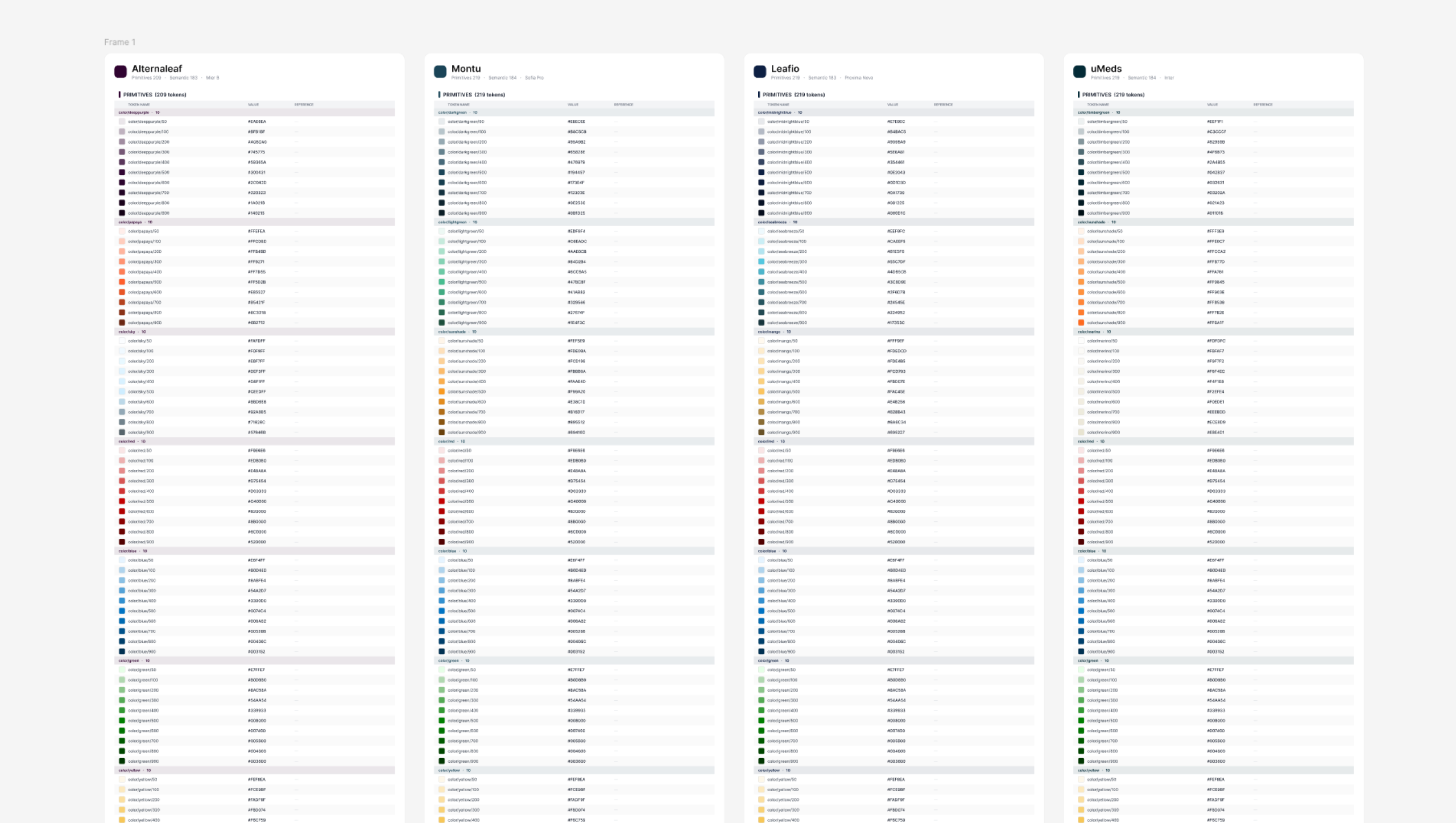
The first target was simple to state and hard to do: take the Figma design system files from four down to one. A single foundation built on a robust token and variable architecture, with brand token files that plug into it, so a designer selects the brand they are working on and the components theme themselves.
That mirrors how the monorepo already worked across Storybook and GitHub, which is exactly the point. With both structures matching, we could use Figma's Code Connect to tie components directly to their code counterparts, making parity something the system enforces rather than something people remember to check.
The north star sat further out. Turn the system into a design.md: a strictly machine readable definition of how and why our design system functions. Paired with tailored Skills, that file lets AI tooling produce on brand outputs that closely reflect not just the Figma file, but the code living in Storybook and GitHub as well.
We started with an audit of the four Figma files, and what came back was telling. The overwhelming majority of what sat inside them were the same foundational components, all built on MUI. Which raised the obvious question: why do we need four files then?
There were genuine snowflakes, components built for one brand and one brand only, and after review we were comfortable treating them as exactly that. But they accounted for roughly 5% of what was otherwise an identical baseline structure across all four.
The bigger find was in the tokens. MUI ships with a fairly strict naming convention, yet the token architecture in each of the four files had gone its own way, and none of them accurately represented what was actually running in Storybook and the code repo. Auditing that architecture let us re-establish parity across the brands on close to the whole system, and strip out values that were either created incorrectly, not attached to any component at all, or quietly causing drift through poor design decisioning.
With the structure cleaned up, we put a governance baseline around it so it would stay that way. The principle is that questions get asked before design decisions get made, particularly when editing an existing component or proposing a new one. Is this a snowflake component? Does it need to be its own component? Can we achieve the same result with components we already have?
Simple guardrails, but they do two jobs at once. They mitigate drift, and they make for a better experience, not just for the end user but for the internal teams working in the system every day.
One gap had to be closed before any of the parity work could function. MUI's own Figma theme exporter had been deprecated four years earlier and nothing had replaced it, which left the handover from design tokens to code tokens as a manual job. So I built my own plugin. It exports the JSON theme package for all four brands in around two seconds, turning what would have been an ongoing chore into a non-event.
With that in place, we brought in Code Connect so the components in Figma mirrored the components in code. That started as drift mitigation, but it became something more useful day to day. Designers could run a check across their own work and see where they had not used a component they should have, or had missed something entirely.
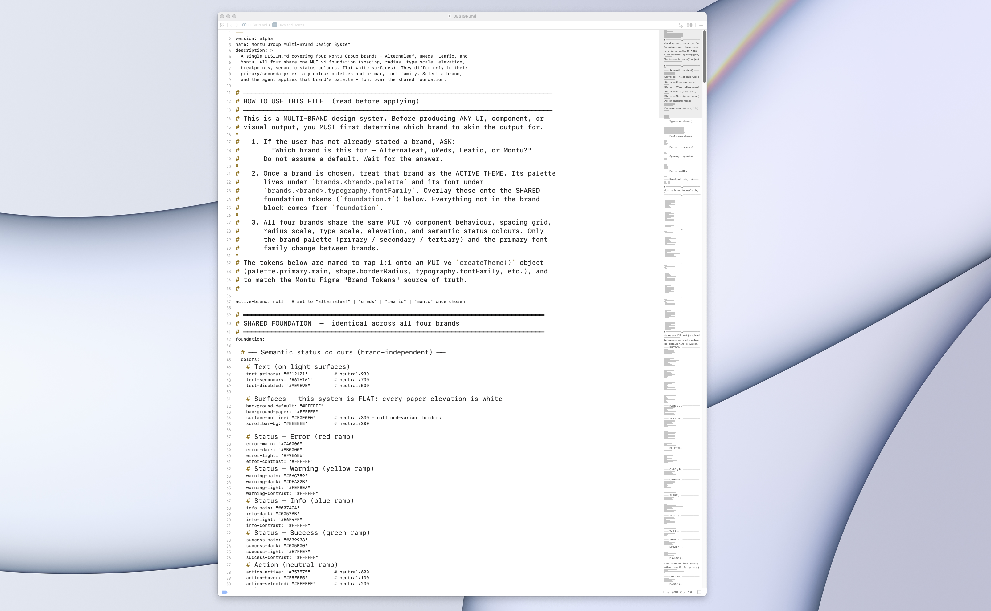
Once that was underway, I built the business's first design.md along with an accompanying Claude skill. The skill acts as a container for the design.md, so it can be pulled into a context window easily without a designer needing to think about the mechanics of how that works.
The design.md itself holds the complete foundational architecture: the components, the naming conventions, all four brands and their token architectures from primitives through to semantics, and any component overrides that exist because of a brand decision. Alongside it sits a YAML section covering the why and the how. Not simply what the system contains, but the reasoning behind the components and the brand choices, and how the whole thing is meant to be used.
The upshot is that anyone can now prompt Claude to run the design system skill with a brief of their own. It asks which brand they are working in first, and then returns something that mirrors a solution designed entirely inside our design system.
The hardest part was not technical. Breaking out of old habits is genuinely difficult, and it took a while for us as a team to stay focused and committed to owning and governing the design system rather than reaching for the familiar quick fix. Once those habits formed and stuck, the flow on effect was very welcome, but getting there took patience.
Code Connect was the manual grind. Getting every component accurately mapped to its counterpart in code was slower and more hands on than anyone expected.
The last one was validating the design.md outputs. Making sure they executed correctly against both the design system guardrails and the code guardrails took a fair bit of back and forth, especially with AI convinced it was right 100% of the time. Once explicit rules were written in, the outputs became far more consistent.
This one does not necessarily have a finish line. The design system is a living artifact of the business, shipped continuously, with updates, maintenance and efficiencies always in progress.
The consolidated library now holds 54 components. Before, that same set was being maintained four times over, once inside each brand's file. An update now happens in one place and ripples out across all four brands, which has taken real cognitive load off the teams.
The design.md has had the sharpest effect on prototyping. Getting to a first on brand prototype used to mean two to four hours of manual work in Figma. It now takes as long as the prompt takes to run, somewhere between five and sixty minutes depending on how much refinement it needs.
What that compression buys you shows up at volume. On one piece it meant delivering 22 high fidelity screens, 11 desktop and 11 mobile, in a single day. Each pass gets faster again thanks to self-healing and self-learning loops, and context building keeps the system current, so it always holds the most up to date understanding of how it should be producing solutions.
The governance side matters just as much. Every designer now works inside the system and the processes around it. Previously there was no real governance in place, and design decisions were made without anyone weighing up the flow on effect. Onboarding is quicker, documentation is faster, and adoption has lifted.
“It feels like we're able to focus on the things that matter now, rather than getting caught in the weeds all the time.” - Lead Product Manager, Montu